Understanding Color Psychology
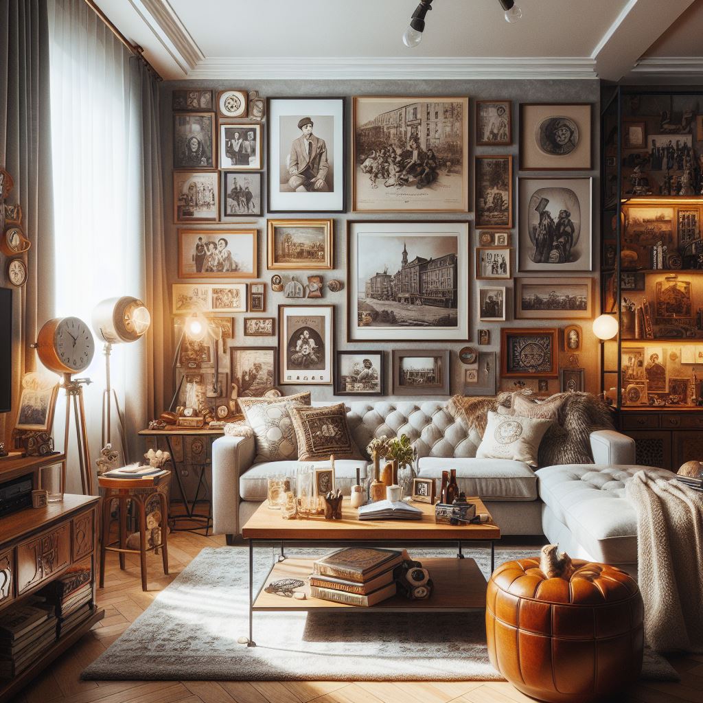
Color psychology delves into the profound influence that colors exert on human emotions, behaviors, and perceptions. Whether consciously acknowledged or not, colors possess the remarkable ability to evoke specific feelings and trigger distinct responses within individuals. Moreover, cultural nuances play a pivotal role in shaping our interpretations of various colors, adding layers of complexity to their significance.
Choosing the Right Color Palette
Selecting the perfect color palette for an interior space requires careful consideration of numerous factors, including the room’s purpose, natural lighting conditions, and personal preferences. From serene neutral tones to bold and vibrant hues, each color scheme imparts its unique ambiance and character to a room. By understanding the principles of color theory and experimenting with different combinations, one can craft harmonious and visually stunning environments.
Neutral Color Schemes
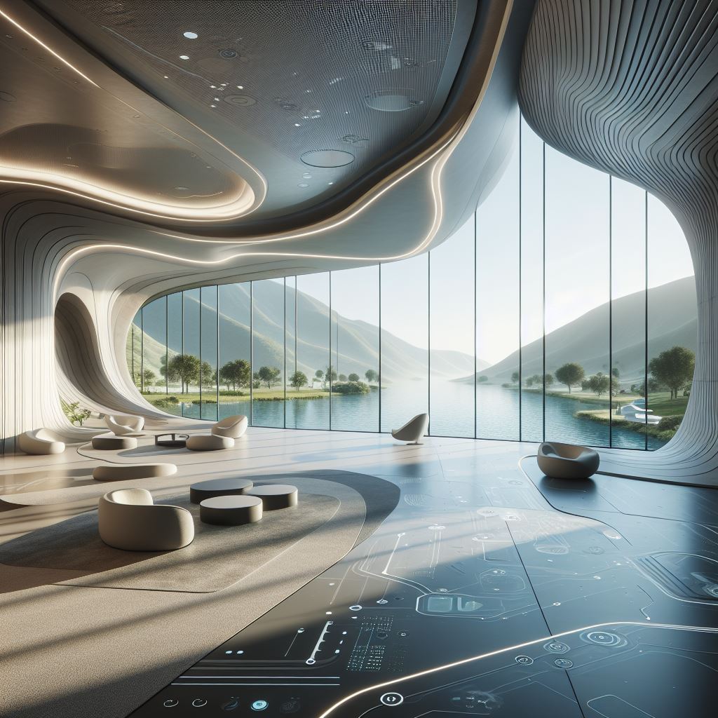
Neutral color palettes, characterized by shades of white, beige, and gray, serve as timeless classics in interior design. Renowned for their versatility and understated elegance, neutral colors provide a calming backdrop that effortlessly complements various decor styles. Whether used as a foundation or accentuated with pops of color, neutrals lend a sense of cohesion and sophistication to any space.
Bold and Vibrant Color Schemes
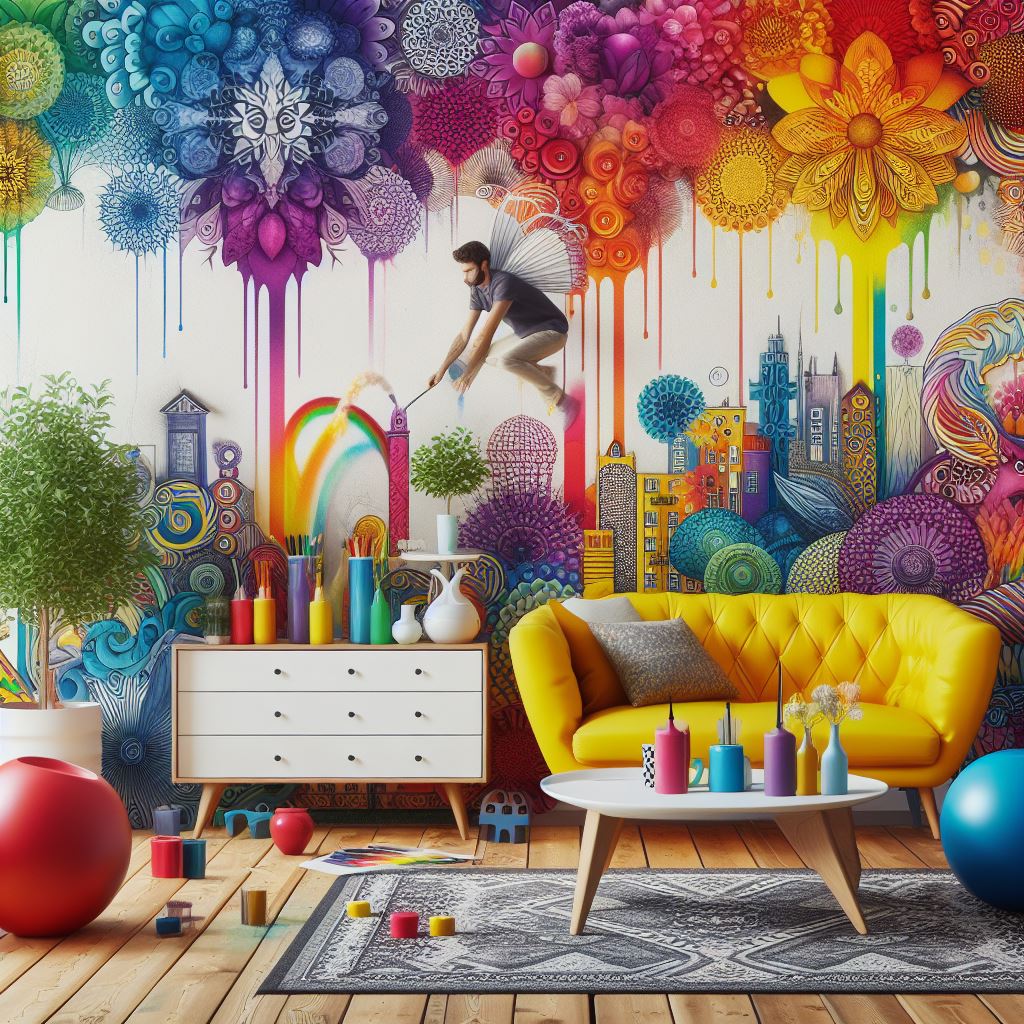
In contrast to their subdued counterparts, bold and vibrant color schemes inject energy and personality into interior settings. From vibrant reds to electric blues, these daring hues command attention and instill a sense of vitality within a room. While their use requires careful moderation to prevent overwhelming the senses, bold colors can infuse spaces with a sense of drama and excitement.
Monochromatic Color Schemes
Monochromatic color schemes revolve around a single base color in varying shades, tints, and tones. This harmonious approach creates a sense of unity and visual interest while maintaining a cohesive aesthetic. By playing with light and dark variations of a chosen hue, designers can achieve depth and dimensionality within a space, resulting in a serene and balanced ambiance.
Analogous Color Schemes
Analogous color schemes draw inspiration from colors that sit adjacent to each other on the color wheel. By selecting hues with similar undertones, designers can create seamless transitions and subtle contrasts within a room. This cohesive approach fosters a sense of harmony and continuity, making it ideal for creating inviting and cohesive interiors.
Complementary Color Schemes
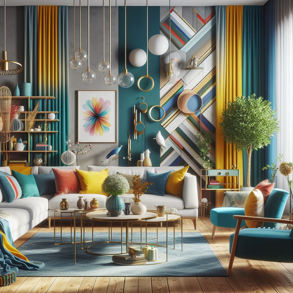
Complementary color schemes revolve around colors that lie directly opposite each other on the color wheel. By pairing contrasting hues, such as blue and orange or purple and yellow, designers can achieve a dynamic visual impact that stimulates the senses. However, achieving balance is key, as excessive use of complementary colors can lead to visual discordance.
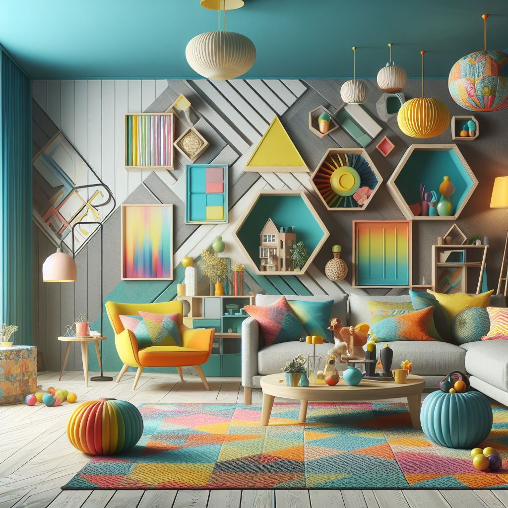
Triadic Color Schemes
Triadic color schemes involve selecting three colors equidistant from each other on the color wheel, resulting in a balanced and visually striking composition. By combining primary, secondary, or tertiary colors, designers can create vibrant and energetic interiors that exude personality and charm. When executed thoughtfully, triadic color schemes infuse spaces with a sense of dynamism and excitement.
Tips for Implementing Color Schemes
When implementing color schemes in interior design, it’s essential to maintain a sense of balance and proportion. Start by selecting a dominant color as the foundation and layer additional hues for depth and visual interest. Consider the room’s function and desired ambiance, opting for soothing tones in bedrooms and lively shades in communal areas. Experiment with color swatches and digital tools to visualize potential combinations before committing to a final scheme.
Visualizing Color with Technology
Advancements in technology have revolutionized the way we conceptualize and visualize interior design color schemes. From virtual room simulations to augmented reality applications, digital tools offer unparalleled opportunities for experimentation and creativity. By harnessing the power of technology, designers and homeowners alike can explore endless possibilities and bring their vision to life with unprecedented precision.
Case Studies: Successful Color Implementations
To illustrate the transformative impact of color in interior design, let’s examine a few notable case studies. From chic urban lofts to cozy countryside retreats, these real-life examples showcase the artful integration of color to enhance spatial dynamics and evoke emotional responses. By drawing inspiration from these exemplary projects, readers can glean valuable insights and apply them to their own design endeavors.
Future Trends in Interior Design Colors
As we look ahead to the future of interior design, it’s clear that color will continue to play a central role in shaping our living environments. Emerging trends indicate a shift towards bold and expressive color palettes, influenced by cultural movements and societal shifts. From earthy tones inspired by nature to futuristic metallics, the possibilities are limitless. By staying attuned to evolving trends and embracing innovation, designers can stay ahead of the curve and create spaces that resonate with contemporary sensibilities.
Conclusion
In conclusion, the power of color in interior design cannot be overstated. From influencing mood and perception to defining spatial dynamics, color schemes serve as the cornerstone of aesthetic expression in our living spaces. By understanding the principles of color psychology and exploring diverse palettes, designers can unleash the full potential of color to create environments that captivate the senses and enrich the human experience.
FAQs (Frequently Asked Questions)
- How do I choose the right color scheme for my home? Selecting the perfect color scheme involves considering factors such as natural lighting, room function, and personal preferences. Start by identifying the mood you want to create and experiment with different combinations until you find the perfect fit.
- Can I mix different color schemes within the same space? Yes, mixing color schemes can add depth and visual interest to a room. Just ensure that the colors complement each other and maintain a sense of balance throughout the space.
- What are some popular color trends for the upcoming season? Earthy tones, jewel tones, and muted pastels are predicted to dominate interior design color trends in the coming season. These hues evoke a sense of warmth, comfort, and sophistication.
- How can I incorporate color into a small space without overwhelming it? In small spaces, opt for lighter shades and use color strategically as accents through accessories, artwork, and furnishings. This creates visual interest without overpowering the space.
- Are there any color combinations to avoid in interior design? While there are no strict rules, it’s essential to be mindful of clashing colors that create visual discordance. Experiment with different combinations and trust your instincts to find a harmonious balance.
